

After 35 years of watching color trends move through the wedding industry, the shift I am seeing heading into 2027 is one of the most distinctive in recent memory. Couples are moving away from the safe, neutral-heavy palettes that dominated the early part of this decade and toward something more specific and personal — richer tones, more considered combinations, and palettes that reflect a genuine point of view rather than a trend board.
This guide covers the 2027 wedding colors that are genuinely gaining momentum, the ones that are beginning to fade, and the specific guidance on how to use each palette in a way that feels current without looking dated in five years.
This post contains affiliate links. I earn a commission on purchases made through these links at no additional cost to you.
The Big Picture: What Is Driving 2027 Wedding Colors
Before diving into specific palettes, it helps to understand what is driving the shift in 2027 color direction. Two major forces are shaping what couples are choosing.
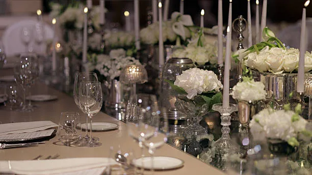
The first is a move away from warm gold metallics and beige neutrals that dominated weddings for several years. Silver is trending in 2027 wedding color palettes. After years of warm tones and golden everything, cool metallics are making a comeback in wedding decor, jewelry, tablescapes, and even bridal fashion. This shift changes the metallic anchor that everything else in your palette hangs from, which has a cascading effect on which colors sit well alongside it.
The second force is a move toward what designers are calling color drenching. The styling trend of 2027 is color drenching: choosing one anchor color and layering it across every texture in the room. Linens, florals, candles, bridesmaid dresses, and stationery all pull from the same palette in different depths and materials. The result is immersive, cohesive, and photographs magnificently.
Together, these two forces produce a 2027 wedding aesthetic that is more intentional, more layered, and more visually distinctive than what came before it.
The key 2027 wedding color trend is layered, expressive palettes that balance soft, timeless neutrals with richer, bolder accent tones.
For a complete guide to color palettes across every season and style, read the wedding color palettes guide on this site. 25 Wedding Color Palettes for Every Season.
Looking for broader wedding trends? See our guide to 2026 & 2027 Wedding Trends.
Below is a quick pairings guide showing the base color and the best colors to pair it with, along with the best season for this color and the venue type it will look great in.
| Base Color | Best Pairings | Best Season | Best Venue Type |
|---|---|---|---|
| Midnight Blue | Champagne, Ivory, Silver | Fall, Winter | Ballroom, Estate |
| Moody Mauve | Copper, Dusty Rose | Fall | Barn, Garden |
| Chocolate Brown | Ivory, Caramel, Dusty Rose | Fall, Winter | Rustic, Intimate |
| Burgundy | Cream, Silver, Sage | Fall, Winter | Church, Formal |
| Powder Pink | Mocha, Deep Plum | Spring, Summer | Garden, Outdoor |
| Wasabi Green | Ivory, Warm Brass | Spring, Summer | Garden, Modern |
| Espresso Brown | Iced Coffee, Ivory | Year-round | Any |
| Plum | Lavender, Cream | Fall, Winter | Formal, Romantic |
The Warm Neutrals: Chocolate Brown, Ivory, and Caramel
If there is one color story that defines 2027 weddings more than any other, it is the rise of chocolate brown as a serious, sophisticated palette anchor.
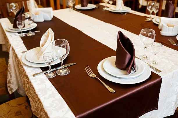
Chocolate brown is perhaps the most talked-about rising palette of 2027. Rich chocolate and espresso tones paired with soft ivory and caramel accents create a palette that feels like the most elevated version of neutral, warm without being predictable, and deeply beautiful in low light.
Think brown velvet chairs, ivory pampas grass, caramel taper candles, and linen table runners. The combination works across every venue type from rustic barns to vineyard estates to historic ballrooms, and it photographs exceptionally well in both natural daylight and candlelit evening settings.
Why this works from a professional planning perspective: brown and ivory are the easiest palette to source across every vendor category. Florists can work with it beautifully. Caterers can coordinate table settings to it. Bridesmaids can find dresses at every price point. It is a sophisticated palette that does not require a large budget to execute well.
For great color combinations, this blog is all about classic, neutral wedding colors.
For decor, chocolate brown velvet table runners and espresso-toned candle holders from Amazon anchor the palette beautifully and cost a fraction of what rental companies charge for the same look.
Check table runners on Amazon.
The Jewel Tones: Emerald, Burgundy, Deep Sapphire, and Plum
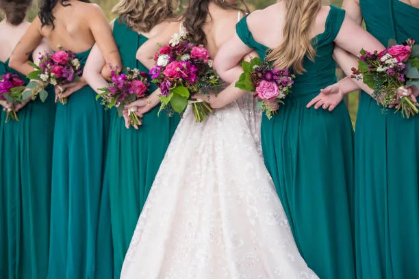
Jewel tones are not new to weddings, but the way they are being used in 2027 is different from previous years. Rather than using jewel tones as accents against neutral backgrounds, rich jewel tones such as emerald, burgundy, and deep sapphire are being used purposefully in linens, floral installations, and styling moments.
Couples are embracing vibrant saturated hues, including cobalt blue, marigold, forest green, and deep plum, layered with rich textures and dramatic florals.
Emerald green paired with warm gold is one of the most requested jewel-tone combinations for 2027. Deep green florals, gold candleholders, rich velvet linens, and warm lighting create an atmosphere that feels genuinely opulent. In 2027, the trend is pushing deeper, with richer forest greens and darker foliage giving this palette even more drama.
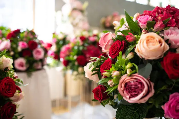
Burgundy is having a particularly strong moment as a primary palette color rather than a supporting accent. Paired with ivory or blush, it reads romantic and timeless. Paired with deep forest green and gold, it reads opulent and dramatic. Paired with dusty rose and sage, it softens into something genuinely beautiful for a spring or early summer wedding.
Deep sapphire and cobalt blue are the choices for couples who want their wedding to feel genuinely bold and memorable. These colors are harder to source at budget price points, but they photograph unlike anything else, particularly in evening settings with warm lighting.
For emerald green velvet napkins and deep jewel-tone linens, Amazon has excellent options at a fraction of rental costs.
Amazon for beautiful napkins to add a pop of color.
Burgundy velvet table runners from Amazon.
The Soft Palettes: Dusty Lilac, Sage Green, Muted Peach, and Blush
Not every 2027 couple is going bold. Alongside the jewel tone movement, there is an equally strong pull toward soft, poetic palettes that feel romantic and timeless rather than dramatic.
Wedding color trends for 2027 include pastel palettes evolving with subtle shades of lavender, sage green, and icy blue, adding modern softness to floral designs, decor, and bridal party looks.
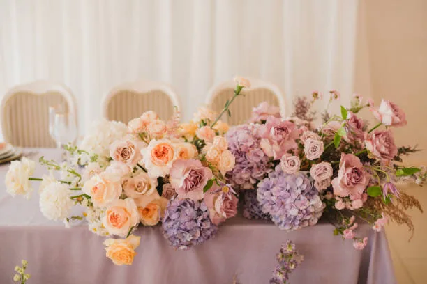
Dusty lilac is the breakout soft color of 2027. Dreamy color palettes, including dusty lilac and mossy green, are defining what designers describe as the whimsical aesthetic, details that feel plucked from a fairy tale. Paired with ivory and soft gold accents, dusty lilac creates one of the most Pinterest-worthy palettes of the year. Paired with sage green and warm cream, it reads like a garden in bloom.
Sage green continues its strong run from 2026 into 2027, maintaining its position as the most universally flattering and versatile wedding color available. It works in every season, with every skin tone, at every venue type, and at every budget level. If you are uncertain about your palette direction, a sage green anchor with soft neutral accents is a choice you will never regret.
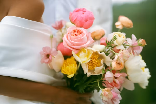
Blush and dusty rose remain foundational choices. Blush tones from dusty rose to muted peach continue to be favorites, offering romantic depth without feeling overly sweet. The shift in 2027 is toward deeper, more muted versions of these tones rather than the bright pinks that were everywhere several years ago.
For dried pampas grass and dusty rose dried florals that work beautifully for soft palette styling, Amazon has excellent options that photograph well and last long after the wedding.
Dusty rose florals from Amazon.
Sage green ribbon to add color and texture from Amazon.
The Metallic Shift: Silver Replaces Gold
This is the single most significant metallic shift in wedding design in several years, and it affects more of your wedding than you might initially expect.
Silver and chrome accents have been trickling into fashion and home design and are now making their way into weddings. Silver is replacing gold, bronze, and warm metals in wedding fashion and decor.
Silver feels classic, a little nostalgic, and quietly rebellious. It is being paired with both warm and cool colors, icy blues, pale lilac, and soft grays for a luxe wintery palette that still feels fresh year-round.
What does this mean practically for your planning? Your candle holders, charger plates, cake stand, and tabletop accents are all candidates for silver rather than gold. Your bridesmaid jewelry recommendation shifts. Your stationery foil option changes. Even the color of your centerpiece vessels is affected.
Silver works particularly well with the jewel tone palettes described above, especially cobalt, deep sapphire, dusty lilac, and emerald. It also pairs beautifully with the warm neutral chocolate and ivory palette, creating an interesting tension between warm and cool that photographs with significant depth.
If you are currently between gold and silver as your metallic choice, the professional direction for 2027 is silver. You can still use warm candlelight and warm florals to balance it; the contrast is actually part of what makes the silver palette feel so intentional right now.
For silver mercury glass vases and silver metallic candleholders, Amazon has beautiful options at accessible price points.
Shop Amazon for mercury glass vases in all shapes and sizes.
The Spring 2027 Wedding Color Palette
Spring 2027 weddings are being shaped by two distinct directions: couples who want the soft, garden-romantic aesthetic and couples who want something bolder and more unexpected.
For the romantic spring direction: dusty lilac anchored by ivory and sage green, with silver metallic accents and white garden florals. This palette works beautifully for outdoor ceremonies, greenhouse venues, and any space with natural light. It photographs softly and elegantly in every condition.
For the bolder spring direction: cobalt blue or marigold yellow used as a primary palette color, paired with crisp white and warm greenery. This is a high-risk, high-reward choice; when executed well, it produces some of the most striking wedding photos of any season. When executed inconsistently, it can feel jarring. Commit fully or choose the softer direction.
For a dedicated guide to spring wedding color choices, read the spring wedding colors guide.
For a look ahead to the wedding color palettes of 2028, this blog covers it all.
The Summer 2027 Wedding Color Palette
Summer 2027 is the season most aligned with the bold jewel tone direction.
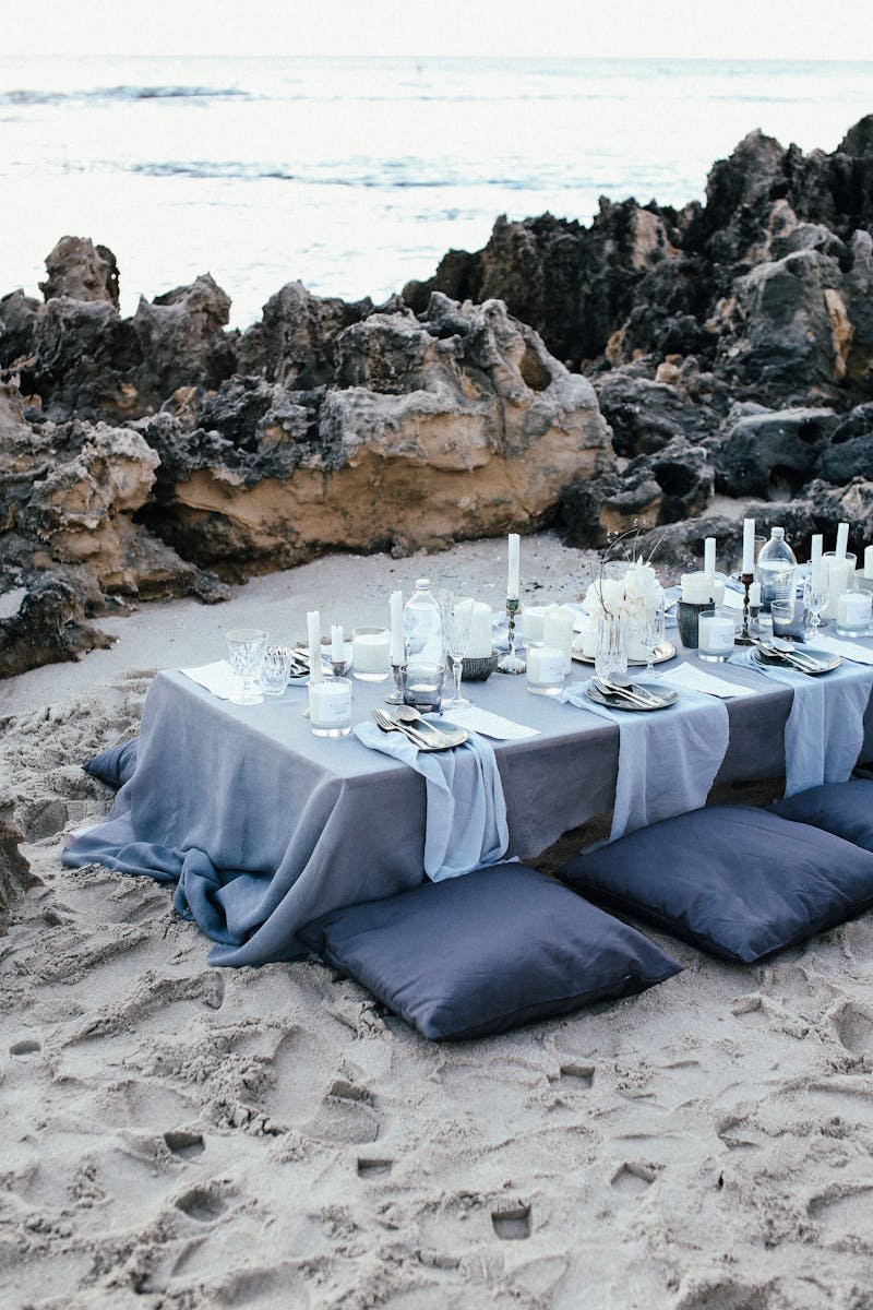
The summer wedding color palette for 2026 and 2027 features deep jewel tones mixed with bright accents to create a striking visual impact. Deep navy paired with soft sandy beige and metallic gold creates a sophisticated look perfect for waterfront venues.
For summer weddings specifically, the combination of emerald green with warm ivory and silver accents is one of the strongest choices available. The green photographs beautifully in strong natural light, the ivory keeps it from feeling heavy in summer heat, and the silver metallic accent connects the palette to the broader 2027 trend direction.
Sage green and terracotta make a stunning combination. Learn how to combine them and accent colors to use in this post.
Terracotta continues to hold its position as a summer staple. It is warm, earthy, and works beautifully with sage green, dusty rose, and creamy white. The key for 2027 is avoiding the oversaturated orange-terracotta that became overexposed several years ago in favor of a more muted, dusty version of the same tone.
For terracotta and warm earth tone decor that works for summer outdoor weddings, Amazon carries excellent options at every price point.
Amazon for terracotta accents.
Colors That Are Fading in 2027
Understanding what is on its way out is as useful as knowing what is rising. These are the colors and palettes that professional designers are moving away from for 2027.
Blush pink as a primary palette color rather than an accent is beginning to feel dated when used in its bright form. The muted, dusty versions of blush remain beautiful and current, but bright millennial pink as a dominant wedding color reads as several years past its peak.
All-white or near-white palettes with minimal color feel less interesting in 2027 as couples move toward the color-drenching approach described above. White as a base with strong accent colors is still completely valid; all-white as the entire palette is starting to look minimal to the point of being sterile.
Warm gold, as the only metallic choice, is being replaced by silver or by combinations of silver and gold rather than gold alone. Couples who want warmth in their metallic palette are increasingly mixing silver centerpiece vessels with warm candlelight rather than relying on gold accents throughout.
Dusty blue, which was one of the most popular wedding colors for several consecutive years, is finally beginning to recede slightly. It is not gone; it remains a beautiful choice. But it no longer reads as fresh or forward-leaning for 2027.
For a full guide to wedding trends worth avoiding, read the Wedding Trends to Avoid guide on this site. Wedding Trends to Avoid in 2026 and 2027.
How to Choose Your 2027 Wedding Color Palette
With this many options, it can feel overwhelming to make a final decision. Here is the professional approach I have used for 35 years.
Start with the venue. Your venue’s existing colors, lighting, and architectural character should anchor every palette decision. A warm-toned venue with exposed brick will fight against a cool silver and cobalt palette. A bright white gallery space will feel washed out by ivory and cream. Let the venue lead.
Then choose one anchor color. Not a palette, one color. Everything else builds around it. Rather than using many colors at once, couples are choosing a limited palette and building depth through fabric, florals, lighting, and finishes.
Then add one accent color and one neutral. Three colors are almost always enough. The color-drenching approach works precisely because the three choices are consistent across every element rather than spread thin across many colors.
Finally, consider your season and light. Colors read differently in direct summer sunlight, in overcast natural light, and under warm candlelight in an evening ballroom. Ask your florist to show you your color choices in the actual lighting conditions of your venue before you finalize anything.
For help selecting a wedding theme that works with your chosen palette, read the guide to selecting a theme for your wedding. How to Select a Theme for Your Wedding.
2027 Wedding Colors by Style
Use this quick reference guide to find your best 2027 palette based on the overall style of your wedding.
Romantic and Garden Style
This palette works beautifully for outdoor ceremonies, greenhouse venues, and any space with natural light.
- Primary color: Dusty lilac or blush
- Accent color: Sage green
- Neutral: Ivory or warm cream
- Metallic: Silver with warm candlelight
- Best venues: Garden, greenhouse, vineyard, outdoor estate
Bold and Dramatic
Choose this direction if you want your wedding to feel genuinely memorable and visually striking.
- Primary color: Emerald green or cobalt blue
- Accent color: Burgundy or deep plum
- Neutral: Ivory or black
- Metallic: Silver or mixed silver and gold
- Best venues: Ballroom, historic estate, city venue
Warm and Rustic
This palette feels grounded and natural and works at every budget level.
- Primary color: Terracotta or chocolate brown
- Accent color: Sage green or dusty rose
- Neutral: Ivory or linen
- Metallic: Warm gold or copper
- Best venues: Barn, vineyard, outdoor garden, rustic estate
Modern and Minimal
Clean lines and a restrained palette make this direction feel sophisticated and timeless.
- Primary color: Dusty blue or soft sage
- Accent color: Ivory or warm white
- Neutral: Linen or warm gray
- Metallic: Silver
- Best venues: Gallery, modern hotel, architectural venue
Classic and Timeless
This palette works in any formal setting and photographs beautifully in every lighting condition.
- Primary color: Burgundy or deep navy
- Accent color: Blush or ivory
- Neutral: Warm cream
- Metallic: Silver or mixed silver and gold
- Best venues: Ballroom, hotel, country club
Frequently Asked Questions About 2027 Wedding Colors
The most popular 2027 wedding colors reflect two distinct directions. The warm neutral direction is led by chocolate brown, ivory, and caramel, while the bold direction features emerald green, deep burgundy, cobalt blue, and jewel tones used as primary palette colors rather than accents. Dusty lilac is the breakout soft color of 2027, and silver has replaced gold as the dominant metallic choice across both directions.
The defining color trend for 2027 is color drenching: choosing one anchor color and layering it consistently across every element of the wedding, including linens, florals, candles, bridesmaid attire, and stationery. The result is an immersive, cohesive aesthetic that photographs with significantly more depth and visual interest than palettes spread across many different tones. Silver as a metallic accent is the single biggest shift from recent years.
Bright blush pink as a primary palette color, all-white or near-white palettes, warm gold as the only metallic choice, and dusty blue as a leading color are all beginning to feel less current for 2027. Muted versions of blush and rose remain beautiful and relevant; the bright millennial pink versions feel dated. This does not mean you should not use these colors if they feel genuinely right for you; it simply means they are no longer the most forward-looking choices available.
Spring 2027 wedding colors are split between a romantic soft direction and a bolder unexpected direction. For the romantic palette, dusty lilac anchored by ivory and sage green with silver metallic accents is the strongest choice. For the bolder direction, cobalt blue or marigold yellow is used as a primary color against crisp white and greenery, producing striking results. Dusty rose and blush remain beautiful spring choices in their muted forms.
Summer 2027 is best suited to jewel tones and bold, saturated palettes. Emerald green with warm ivory and silver accents, deep sapphire with white and silver, and terracotta with sage green and cream are all strong summer 2027 choices. The strong natural light of summer handles saturated colors better than any other season, making it the ideal time to use the bolder palette options that might feel heavy in autumn or winter.
Silver is the professional recommendation for 2027. After several years of warm gold dominating wedding design, silver is the fresher, more current metallic choice, and it pairs beautifully with both the jewel tone and soft pastel directions that are leading 2027 color trends. That said, if your venue has warm tones or your palette is built around chocolate brown and terracotta, warm gold or copper will still feel more harmonious than silver. Mixing silver and gold intentionally is also a strong 2027 approach; the key is intentionality rather than defaulting to gold simply because it was the standard choice for the past several years.
Start with your venue, then choose one anchor color, one accent color, and one neutral. Three colors applied consistently across every element of your wedding through the color-drenching approach is more effective than a larger palette applied inconsistently. Let your venue lighting guide your final choices; colors read significantly differently under bright summer sun, overcast natural light, and warm evening candlelight.
Final Thoughts
The most important thing I can tell you after 35 years of helping couples navigate this decision is to choose colors you genuinely love and wear in your real life. Look at the colors you actually wear and love. If your wardrobe is full of neutrals and warm creams, a chocolate brown or sage ivory palette will feel authentic to you. If you dress in jewel tones, cobalt, emerald, or midnight blue might be calling your name. Your wedding should feel like a beautiful extension of yourself, not a departure from it.
The 2027 trends described in this guide are a starting point, not a prescription. Use them to understand the direction the industry is moving and to permit yourself to choose something bold, something soft, or something in between. Then make the choice that feels genuinely right for your relationship and your day.
For a complete guide to wedding decor that brings your color palette to life across every element of your wedding, read the wedding decor ideas guide on this site.
And for the full picture of what is trending and what is worth skipping across every aspect of 2027 weddings beyond just color, read the combined 2026 and 2027 wedding trends guide on this site.
Chris Ramsay is a wedding planner with over 35 years of experience in hospitality, country clubs, and event planning. She shares practical wedding advice, budget-friendly ideas, and real-world tips to help couples plan stress-free weddings at Well Chosen Weddings. Learn more about her on her about page.
Make Wedding Planning Easier
Planning a DIY wedding means keeping track of more than decorations. You also have a budget to manage and a wedding day to organize. I created these shortcuts to help you with your wedding planning.
Wedding Budget Tracker
Keep your wedding expenses organized and see exactly where your money is going.
Wedding Day Timeline
Keep your wedding day organized so you know what needs to happen and when.
Your thoughts and recommendations are spot on. My daughter is getting married next year and has asked for my help. I’m looking forward to helping her through this exciting time in her life. Thanks!
Thank you so much for your comment. I am happy to help. Let me know if any questions come up.